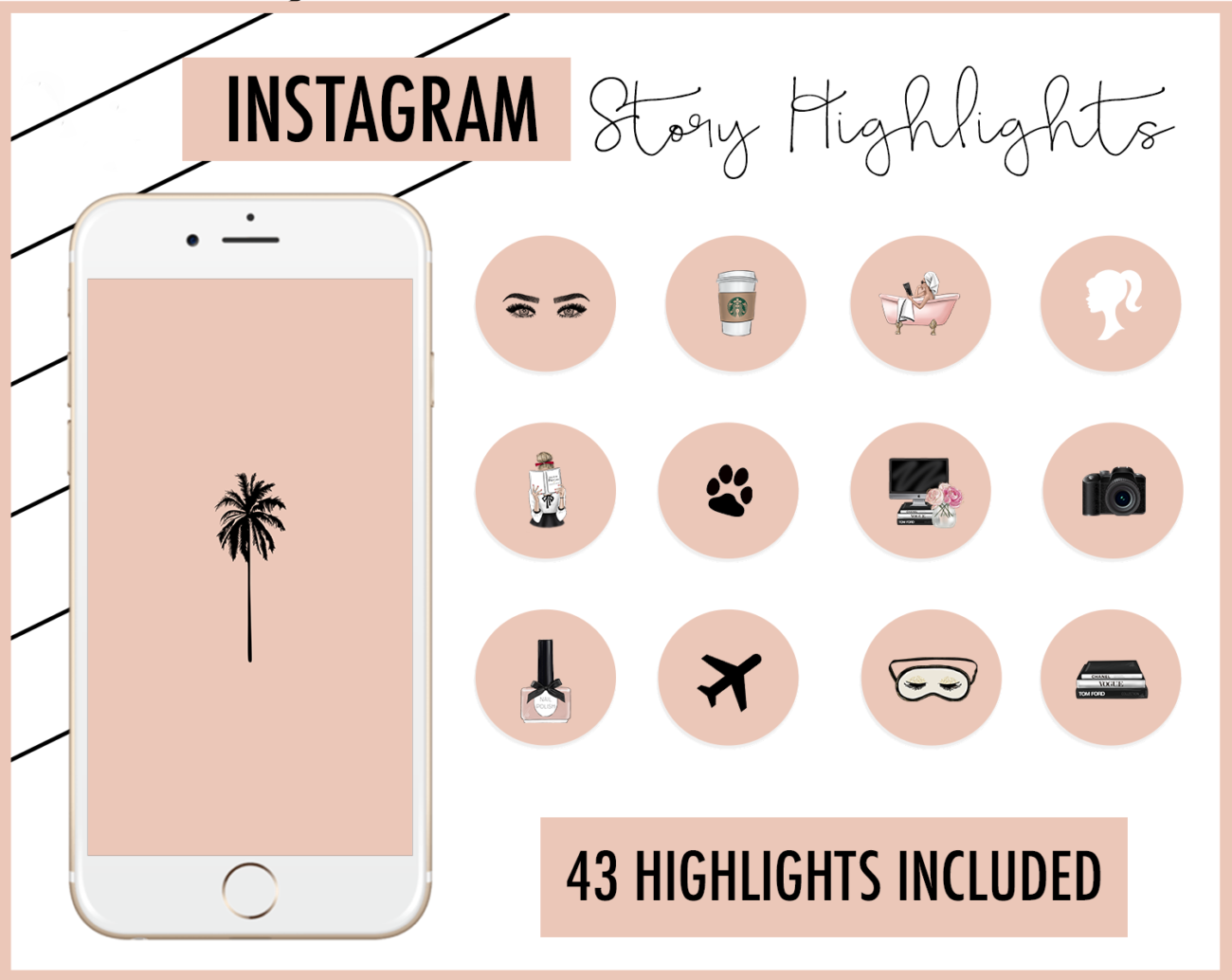
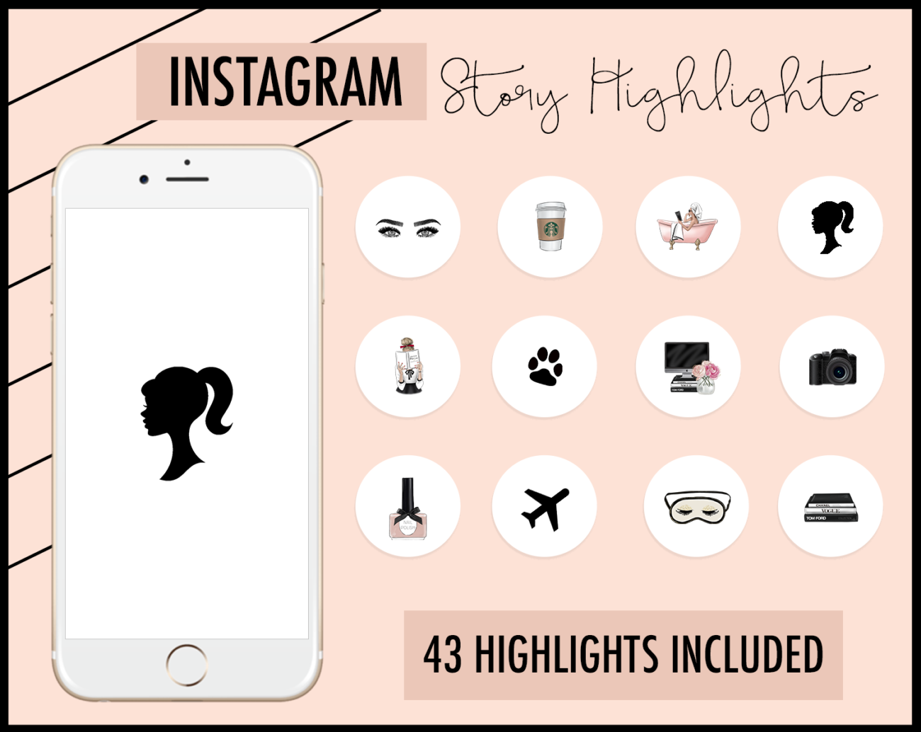
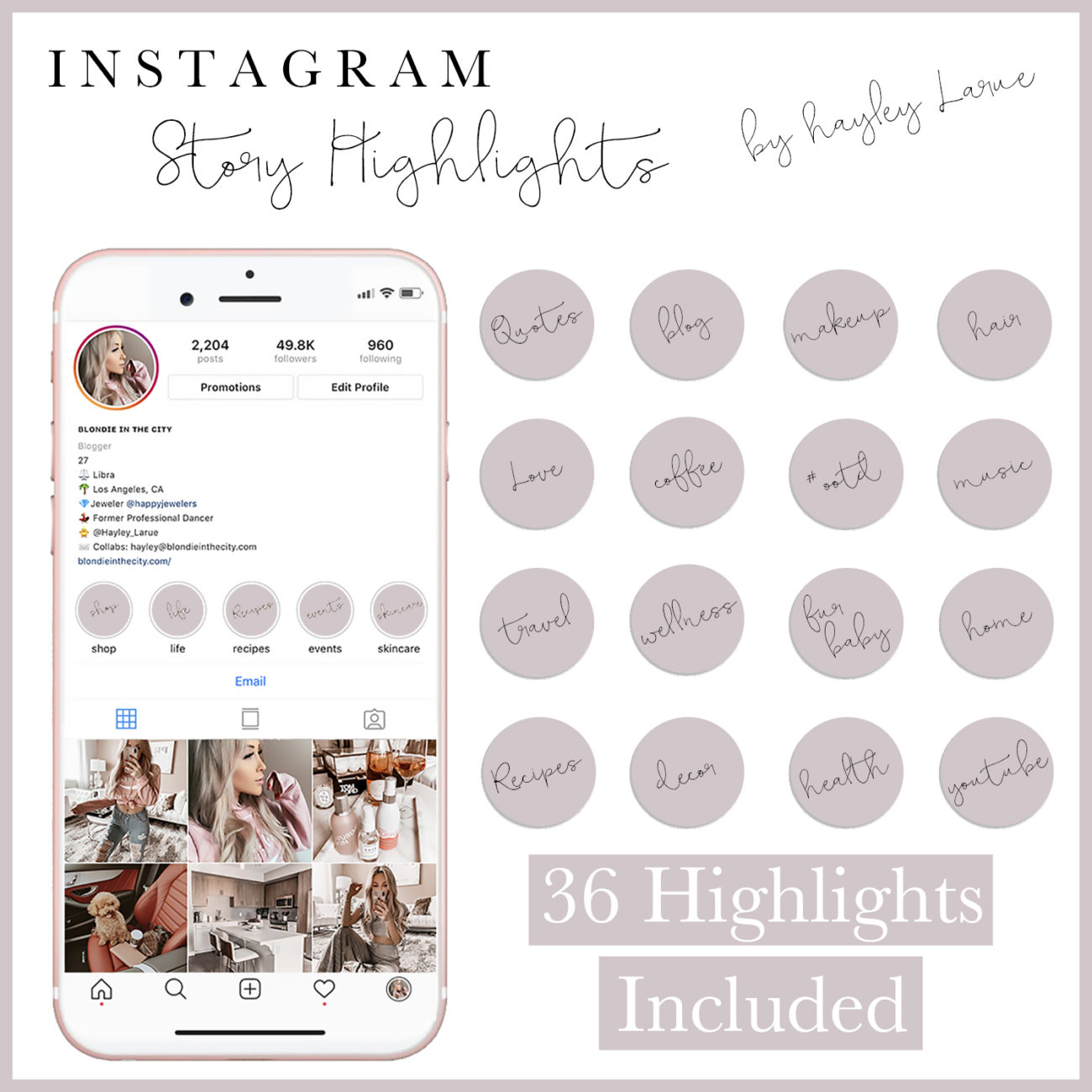
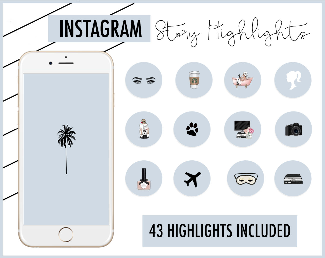
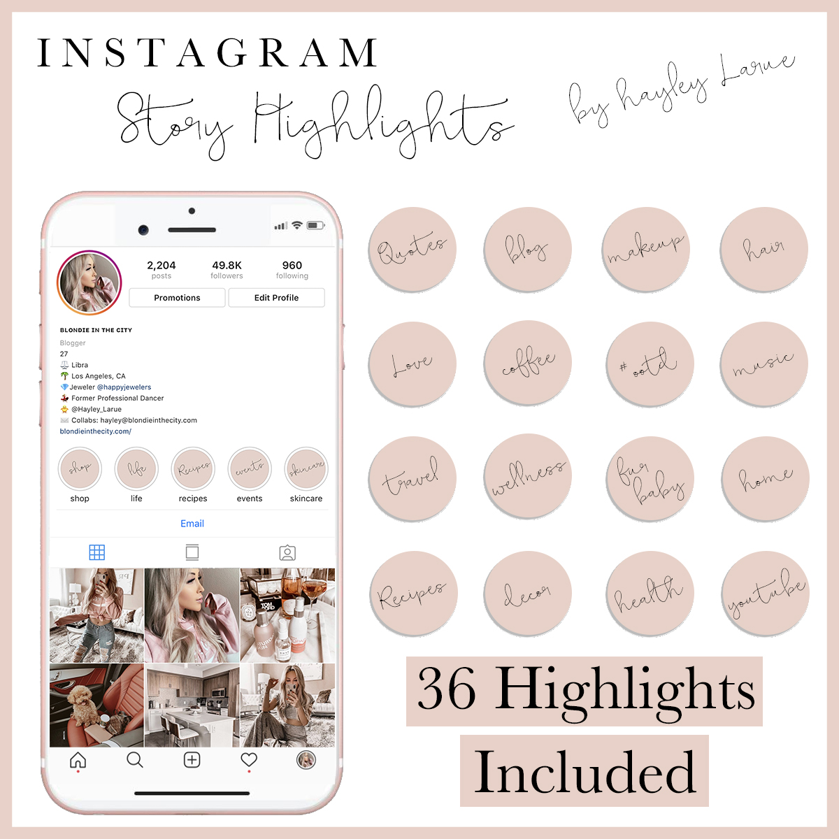
Are we loving the new highlights I came out with? I had originally made the clipart style ones for myself, and I was getting so many DM's from people asking where they could buy them... but I had actually purchased clipart from a seller on Etsy, and then made them into highlights. Well, I purchased the license she offers so people can use her art for things like this, and now here we are. They're officially available!! I will come out with more, but I wanted to get some opinions for other color options. I was thinking of doing back, for the handwritten style covers with white writing maybe? idk. Let me know your thoughts.
But onto the real topic here.... if you don't have highlight covers for your instagram stories, well... what are you waiting for?! Covers for your stories totally change the look and feel of your profile, and whenever anyone is visiting your profile for the first time, it's one of the first things they see, and it really should be aesthetically pleasing. An aesthetically pleasing page is what will determine that person hitting that FOLLOW button or not. It's your first impression. When I go to someone's page for the first time, I literally will know within seconds if I want to follow them or not. I mean, think about it... when highlight covers first became a thing, weren't you like "omg, their page looks so good," or "omg, I want these for my instagram!" - I feel like this is a topic I need to add to my Blog/Instagram Tips Post... Highlight Covers also make your profile look organized, and it also makes it easier for your followers to know where to find what. Each time I get a question on how I edit my photos, I direct them to the "Editing" story Highlight... Highlights in general are great for keeping all of the important stuff documented right there on your profile for easy access at all times, but the Covers are what organize it all and keep your profile more "uniformed."
Ah, these look amazing!
Candice | NatalyaAmour.com
Wow